Visualization is key aspect of data analysis and communication, and has been an integral part of my scientific and business data analysis work. From dynamic dashboards for regular decision making with real time data sources, to curated graphics designed to tell a story, to monitoring data quality, visualizations can quickly highlight patterns and flag issues. Throughout my career I have regularly used R (Shiny, ggplot2, plotly, base graphics), Python (matplotlib, seaborn, Django, plotly), Sisense Periscope, Tableau, and Excel for developing data visualizations and dashboards.
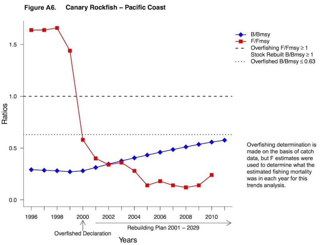
I have found many opportunities to write R and Python scripts to automate development of figures, text, and table for reports that need to be delivered on a regular basis, saving time and improving reproducibility. While working as a contractor and Knauss Marine Policy Fellow with NOAA Fisheries, I developed figures, text, and table for two national, annual reports: Fisheries Economics of the United States, which summarizes the economic performance of the fishing industry for stakeholders, and Trends Analysis for Fish Stocks in Rebuilding Plans, which summarizes and illustrates the rebuilding progress of overfished stocks. This work involved compiling, checking, summarizing, and visualizing large data sets. I developed scripts in R and R Markdown to automate this process and these scripts can be used to easily generate these products for future reports.
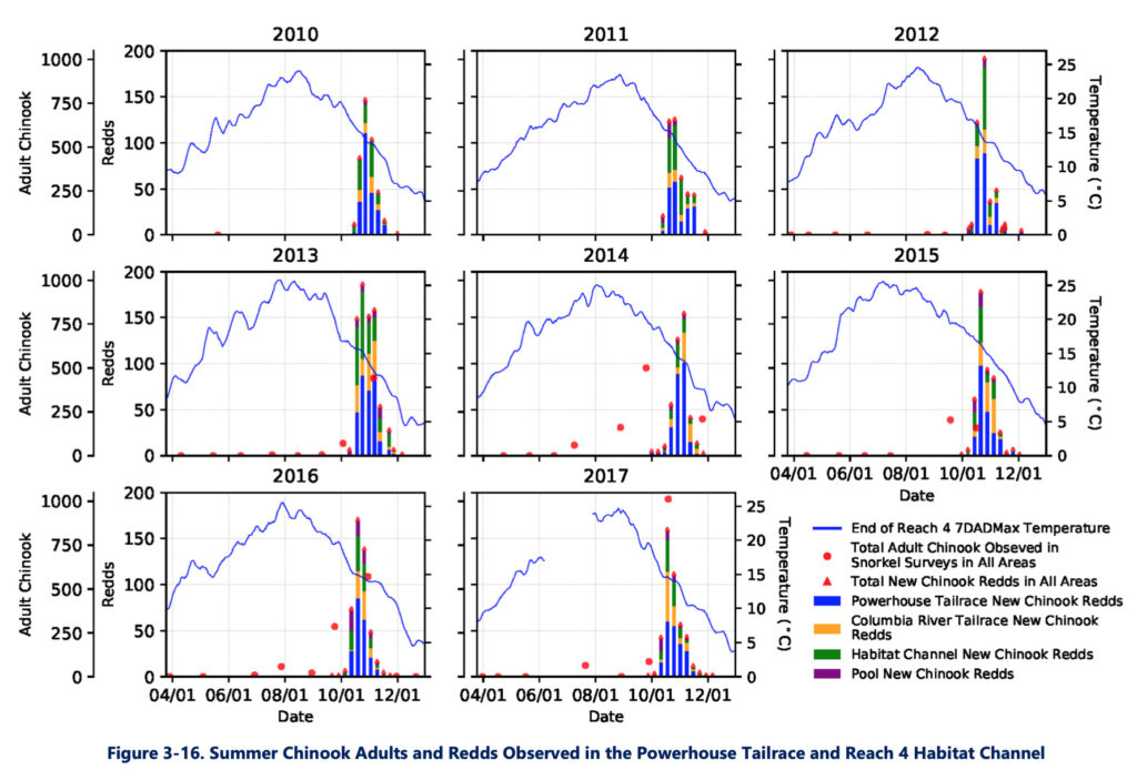
While working with Four Peaks Environmental Science & Data Solutions, I provided a comprehensive summary of the findings from almost a decade of temperature, flow, water quality, fish monitoring in the Chelan River. I led the data components of this project, compiling data from disparate sources into standardized data tables, analyzed and visualized data to identify key insights, designed visualizations to show interrelated components using Python, and shared findings through a report.
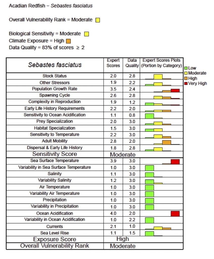
While working as a Knauss Marine Policy Fellow with NOAA Fisheries, I contributed to an assessment of the vulnerability of 82 marine fish and shellfish species to climate change. I developed R scripts to quickly run bootstrap analyses and visualize the results of the vulnerability assessment, which have been used in applications of this methodology in other regions of the U.S. to assess the vulnerability of other marine species to climate change. I also helped facilitate a workshop of experts contributing to the assessment and determine how to best implement and analyze the results of this assessment. Our team shared the results of this analysis in a scientific article.
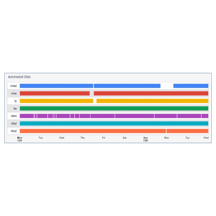
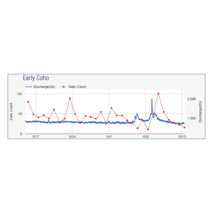
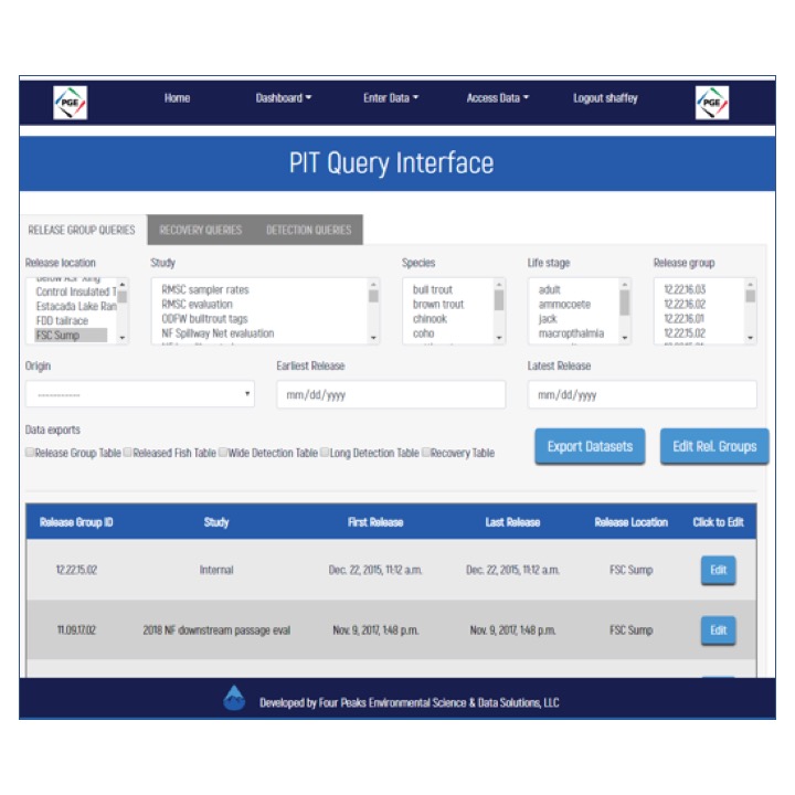
While working with Four Peaks Environmental Science & Data Solutions, I updated and maintained data dashboards developed utilizing the Django web framework for Python. These dashboards provided real-time monitoring of equipment so failures could be addressed in a timeline manner, visualizations of the correspondence of biological and environment variables, and an interface to generate reports needed to provide to regulators, in addition to many additional features.
I shared related insights through a presentation at the 2019 Washington-British Columbia American Fisheries Society Chapter Annual Meeting.